a MOBILE APP FOR THE MAKERSPACE COMMUNITY
Background
Partico was created for a user-centered design course in the Human Centered Design and Engineering department at the University of Washington. The project's goal was to create a tool that empowers makers, people who use makerspaces, of all skill levels to learn new skills and hone their existing ones. A makerspace is an open space in which people gather to work on projects. Makerspaces provide access to a wide variety of specialized software, tools, and materials for building a wide variety of projects: 3D printing, electronics, robotics, metalworking, woodworking, sewing, and more. Partico was designed to encourage discovery, creativity, and community.
Project Type
Team project with Jojo Le, Mackenna Lees, and Kelly Xu
Project Components
Competitive analysis, user research, personas, context scenarios, design requirements, design sketches, storyboards, sitemap, paper prototypes, wireframes, style guide, and hi-fidelity mock-ups
Timeline
January - March 2017 (10 weeks)
Competitive analysis
Prior to our user research, each team member conducted a competitive analysis on a relevant website. The first site we chose was the message boards for the University of Washington's Area 01 Dabble Lab makerspace. Second, we selected the Sodo MakerSpace, a private Seattle-based makerspace. Finally, we analyzed Makezine and Instructables, two well-established sites centered around the do-it-yourself (DIY) community.


The data gathered during the analysis was extremely helpful when designing our interview protocol.
User Research
Understanding maker's pain points, needs, and goals was key to building a strong project foundation. To gain this insight, our team conducted four interviews with members of the two University of Washington makerspaces: CoMotion and Dabble Lab.
Comotion

Dabble Lab

Key Findings
While analyzing our interview data, we uncovered five key findings:
- There are long wait times to use certain equipment or materials
- Staff members are difficult to locate when assistance is needed
- There is a lack of resources for learning new equipment, tools, and techniques
- Events in the space are not well advertised
- Members want an easy way to meet other members
personas
Using our findings from our user research, we identified key characteristics, abilities, pains, desires, goals, and scenarios for our two primary personas. These two personas were an invaluable tool during the design process. Whenever we found ourselves unsure of our direction, we relied on our personas to refocus ourselves.
Prior to our user research, provisional personas were created using the team's collective knowledge about makerspaces and our competitive analysis of relevant tools.
Building off the provisional personas and utilizing our user research, we developed our refined personas.
context scenarios
After developing the personas, we strived to gain an even deeper understanding of the contexts in which makers would use our application. To do this, we identified persona expectations and wrote a number of context scenarios that showed how our product might best fit into maker's lives.
design requirements
Utilizing our refined personas and context scenarios, we set out to determine what the application would do. To do this, we separated our design requirements into data, function, and contextual elements.
Design Sketches
Using our design requirements as a guide, we started to sketch our ideas.


A number of preliminary design sketches were created by each team member individually. The team then reviewed, critiqued, and combined our ideas into refined sketches.
storyboards
By combining our context scenarios and our design sketch ideas, we were able to create rich visual narratives using storyboards. These storyboards allowed us to visualize how our application would be used in relevant scenarios.


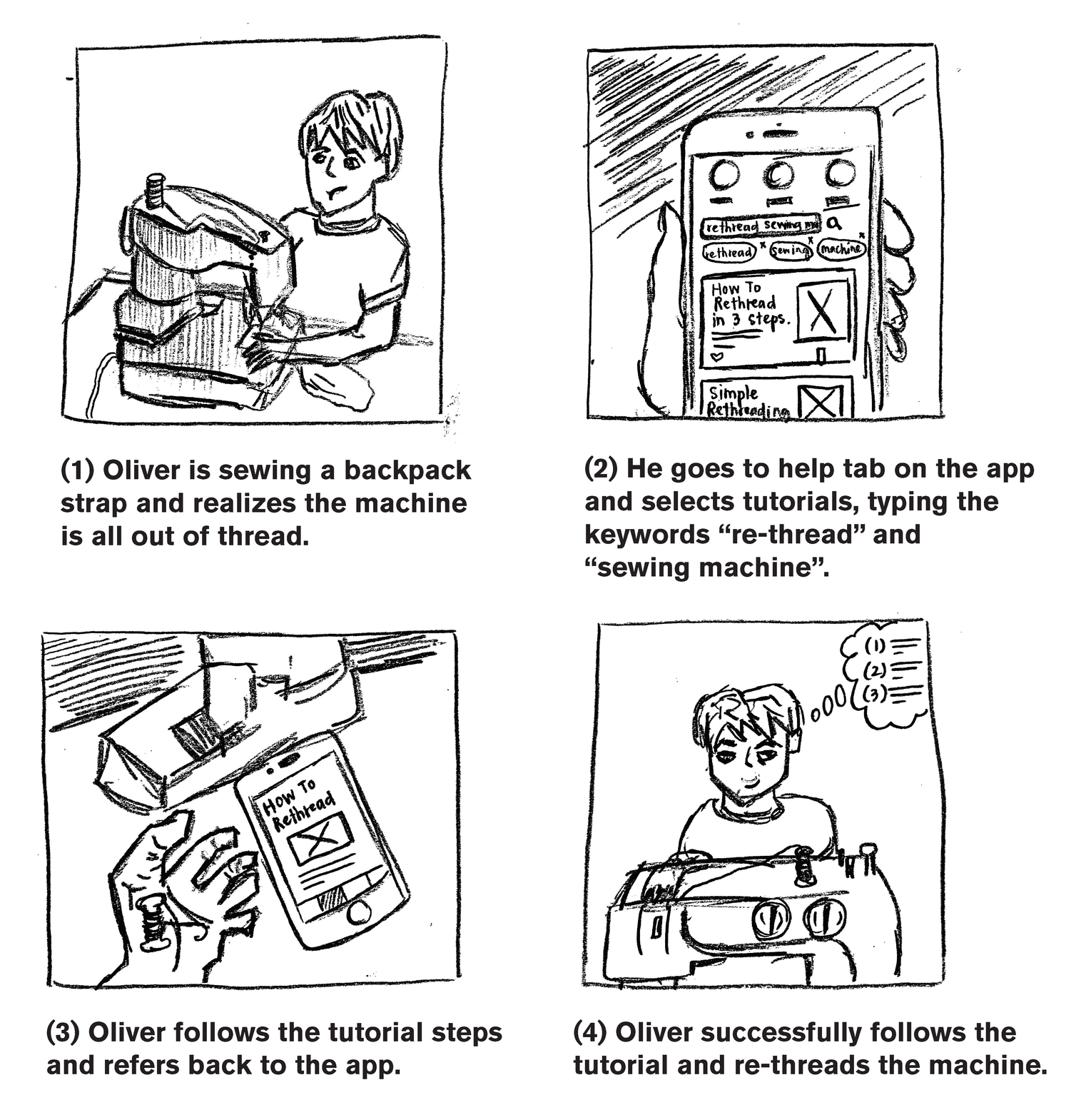


Each team member independently developed a handrawn and photo storyboard.
Information architecture sitemap
With a firm understanding of what the application would do and how makers might use it, we began to look at the big picture. By mapping the overall structure, we started to organize the application's high-level components and see relationships emerge.
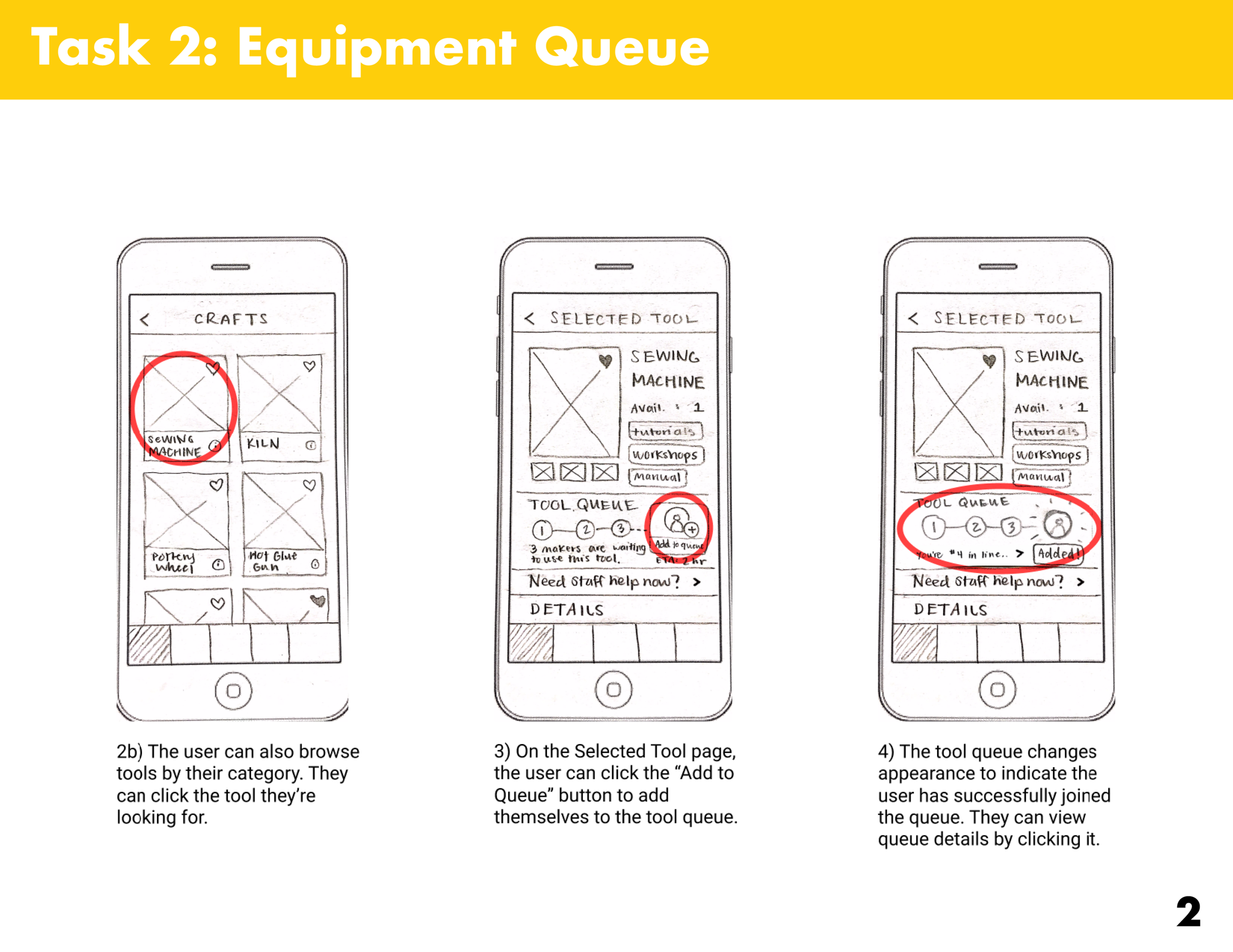
Paper prototypes
After developing the sitemap, we created paper prototypes of the system's interface. The prototypes were used to conduct usability evaluations of three key task scenarios selected from our design sketches and storyboards.

task 1
Alert a makerspace staff member that you need help replacing filament in a 3D printer.

task 2
Add yourself to the sewing machine equipment queue. Once added, check your estimated wait time for the queue.

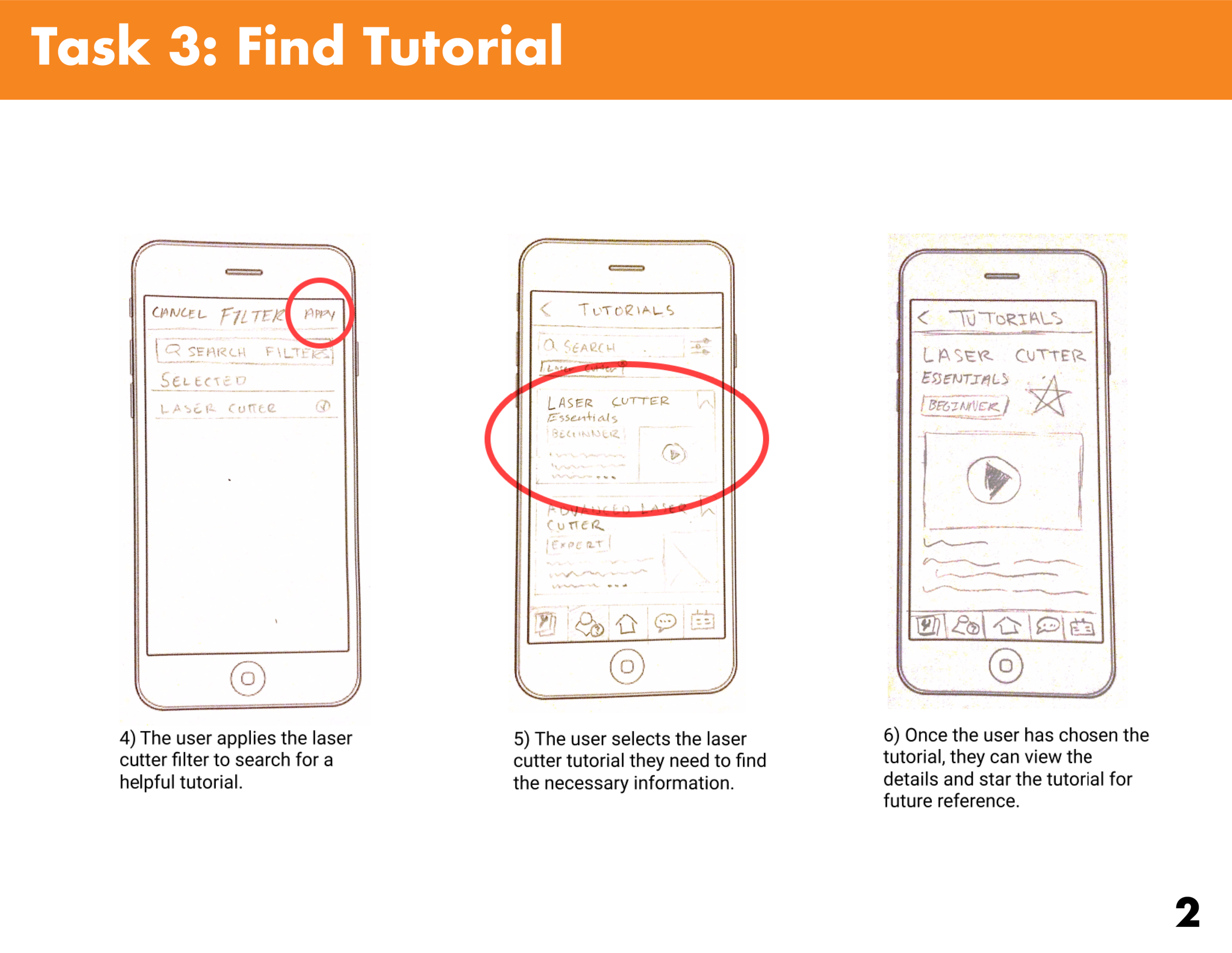
task 3
Search for a beginner laser cutter tutorial by using search filters.


key findings
After conducting the evaluations, we analyzed the data from our notes and discovered five key findings:
- The Tool Library and Help navigation tab icons were unclear or misinterpreted
- Where to create new messages (Help tab) and to access received messages (Messages tab) was not obvious
- The participants were not confident in searching for tools by category
- Locating the estimated wait time for an equipment queue was ambiguous
- The "See all" button in the Favorite Tools sections was misinterpreted
We recruited four participants for our usabilitity evaluations, each with differing backgrounds: electrical engineering, finance, mechanical engineering, and psychology. All participants were members of the Dabble Lab makerspace.
wireframes
Utilizing the key usability evaluation findings, we refined and improved our interface. To outline the purpose and functionality of our application as a whole, we created annotated wireframes of the entire system. In addition, to showcase how common interactions might look, we developed three state transition diagrams.
Annotated Wireframes


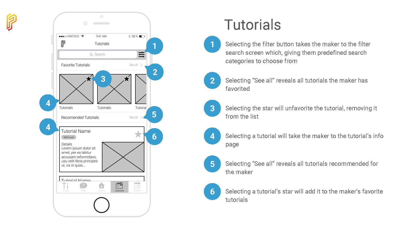


Each wireframe was annonotated to clearly indentify any possibly ambiguous component or feature.
State Transition Diagrams

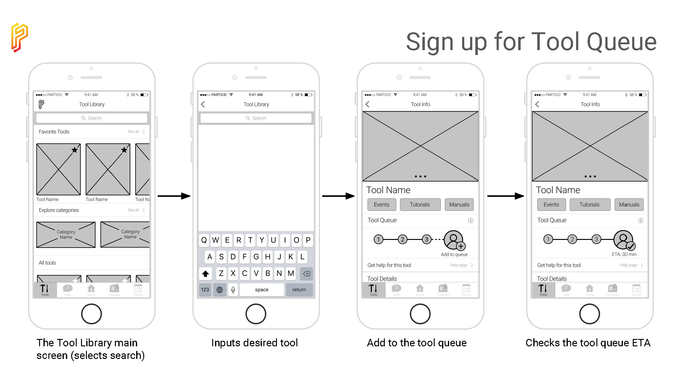

The state transition diagrams were used to show key paths through the system. The three chosen diagrams were the same key tasks used in the usability evaluations.
style guide
Before moving on to our high-fidelity mockups, we developed a basic style guide to help us maintain a consistent look and feel throughout the application.


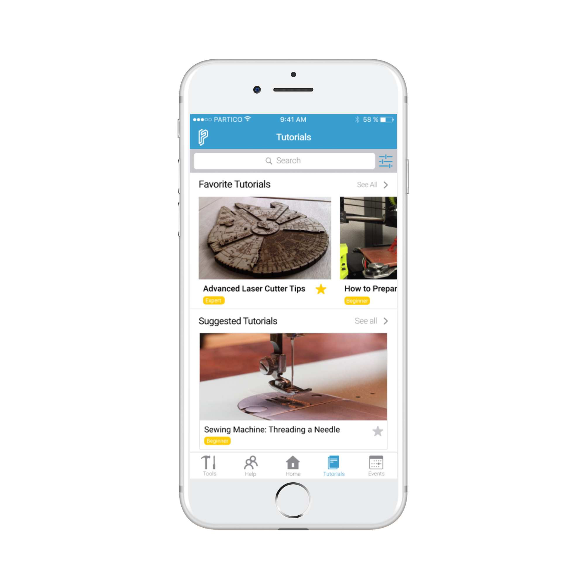
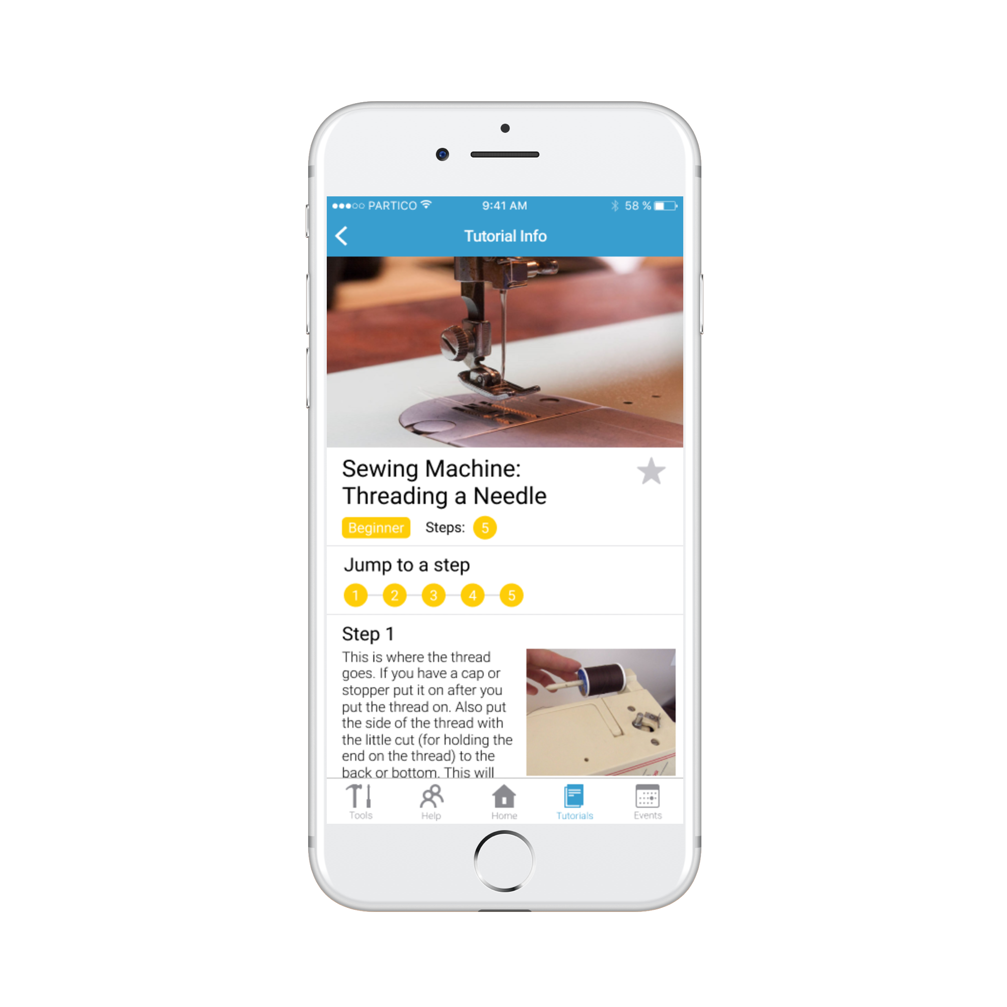
High-fidelity mockups
The high-fidelity mockups were the final deliverable for this project. These mockups represent our refined information architecture, components, features, and aesthetics which evolved throughout the user-centered design process.